Out Loud Rebrand
Intro: Tasked with rebranding a non-profit business in Louisville that works with young children and adults in marginalized communities and spectrums. We created a more inclusive visual identity with bold colors and vibrant and forward designs in the rebrand.
First rebrand logo design
Final rebrand logo design
Research: In researching how we would tackle the rebrand, we studied other brands and businesses that had similar roles or products as our clients, in how they presented themselves through colors, social presences, website look, and how they work as a brand.
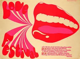
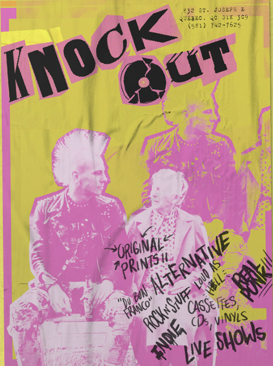
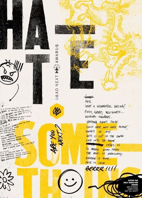
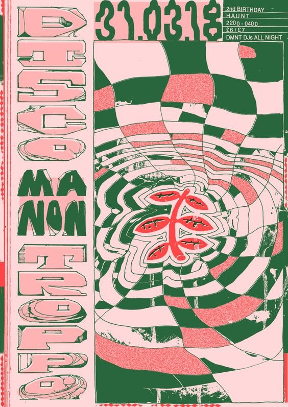
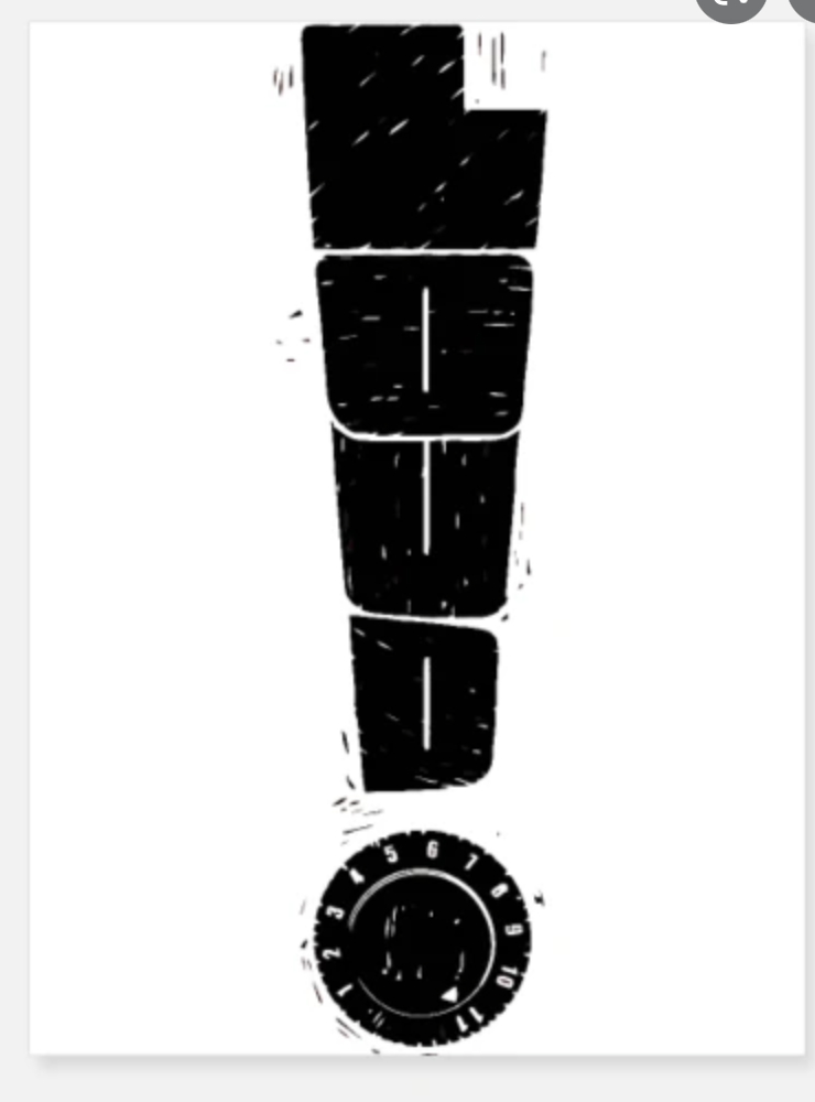
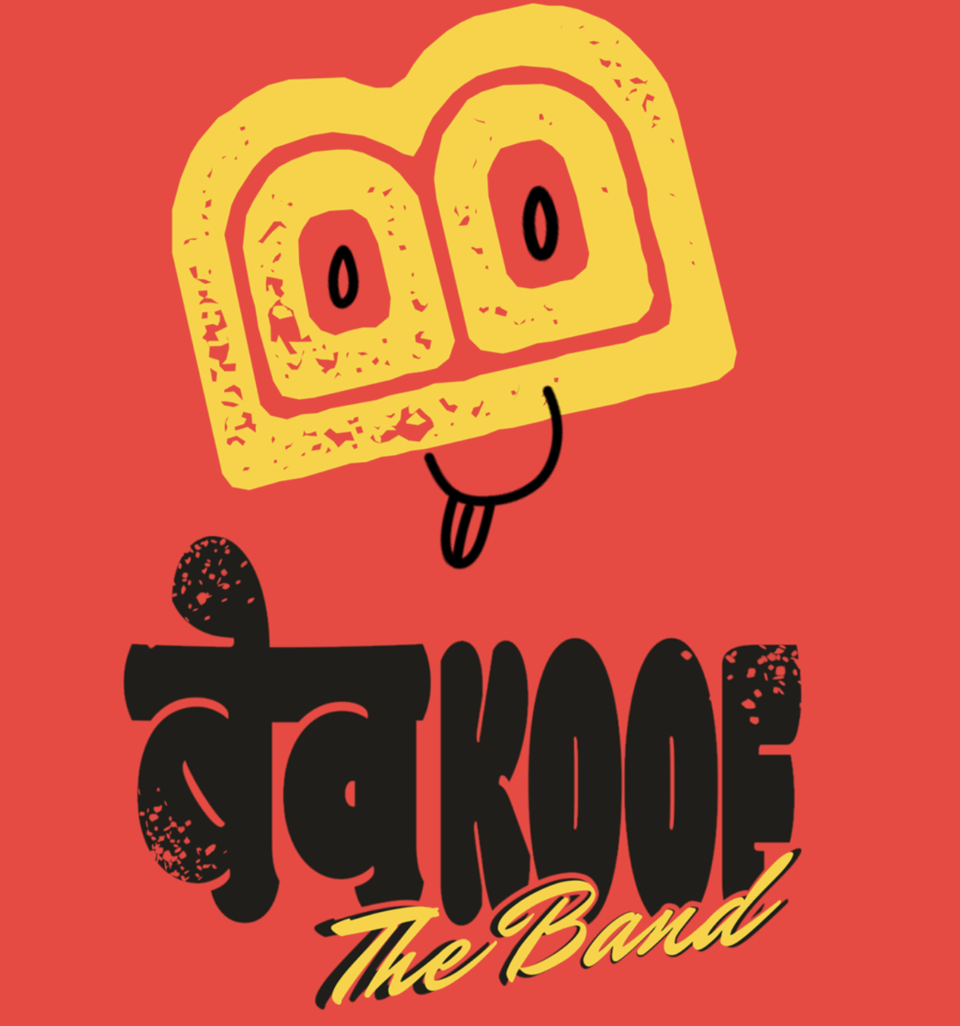
My Part: As part of the research, and tasked with planning the flow, functionality, and look of the new OLL brands website. I also looked at the old brand's social media. I promoted a more active presence with the visual hierarchy of color-corraded materials. In researching the new logo, we considered the current look. With multiple versions of a broken record which proved to be a very close resemblance to another used logo, we had to think of another alternative. Learning that they produce records of the music produced by the summer groups, we implanted the form into the logo and logotype.
Solution: The result of all parts gave our clients a whole new rebranded look with website layouts, poster designs, a new logo and logotype, stationaries, and social media post designs. As well as a lot more to help promote the new look and get a kick start into the new branding.


